




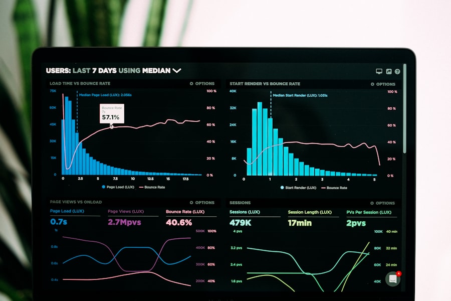
An OEE dashboard usually fails on what sits underneath the charts: every department calculates OEE differently, operators type in downtime reasons after the fact, machines aren't connected to the MES or ERP, and nobody owns the numbers. What works is one agreed definition, automatic data collection, downtime reasons captured at the source, a dashboard per role, and a short action cycle.
This article covers the software side of OEE: which data you need, where it comes from, and how to set up the integrations and data layer so the dashboard gets used every day. For improving processes more broadly, read our guide to process optimisation with software.
What an OEE dashboard measures
OEE stands for Overall Equipment Effectiveness. Seiichi Nakajima introduced the measure in the 1970s as part of Total Productive Maintenance (TPM). OEE multiplies three factors:
- Availability. The share of planned production time in which the machine is running.
- Performance. How fast the machine runs compared with its ideal cycle time.
- Quality. The share of units produced that are right the first time.
A worked example makes it concrete. A shift has 480 minutes of planned production time. The machine stands still for 60 minutes because of a breakdown and a changeover. The ideal cycle time is 30 seconds per unit. The shift produces 714 units, of which 700 are good.
| Factor | Calculation | Result |
|---|---|---|
| Availability | 420 of 480 planned minutes | 87.5% |
| Performance | 714 units out of a maximum of 840 in 420 minutes | 85.0% |
| Quality | 700 good units out of 714 | 98.0% |
| OEE | 87.5% × 85.0% × 98.0% | 72.9% |
You get the same result with a shorter route: 700 good units times an ideal cycle time of 0.5 minutes, divided by 480 planned minutes.
You'll often hear that 85% is world class. According to OEE.com, Nakajima set that figure from practical experience as a minimum to strive for, with targets of 90% availability, 95% performance, and 99.9% quality. The same source notes that most manufacturers sit closer to 60%, and that the benchmark comes from the Japanese automotive industry of the 1970s. So compare mainly with your own line last month, and less with a number from outside.
Why OEE dashboards fail
Downtime is expensive, which is why many plants start an OEE dashboard with real enthusiasm. In The True Cost of Downtime 2024, Siemens estimates that unplanned downtime costs the world's 500 biggest companies 11% of their revenues. An average large plant in that study still loses 27 hours a month to unplanned downtime.
Even so, we often see dashboards a few months later on a screen nobody looks at anymore. The causes are similar:
| Cause | What you see on the floor | What works |
|---|---|---|
| No single definition | Two lines at 70% that can't be compared | One agreed calculation rule in the data layer |
| Manual entry | Yesterday's figures, filled in at the end of the shift | Machine status and counts collected automatically |
| Missing downtime reason | A large bucket labelled "other" or "unknown" | Reason chosen at the machine, at the moment it happens |
| Isolated machines | Only the newest line appears on the dashboard | Older machines connected through an integration |
| Nobody acts | A good looking number with no follow up | A dashboard per role and a fixed meeting with actions |
Definitions. One department removes planned maintenance from planned time, another doesn't. One shift counts changeovers as downtime, another as production time. Until those choices are written down, everyone is talking about a different number.
Manual entry. Someone who fills in downtime from memory at the end of a shift rounds off and forgets short stops. Those short stops and speed losses are exactly what drag down the performance factor, and they disappear from view.
Data quality. An ideal cycle time that hasn't been updated in years, or a product without a standard, produces performance above 100%. After a few of those outliers, nobody trusts the dashboard.
No action. A number without an owner changes nothing. If the operator, the team lead, and the plant manager all get the same screen, it fits none of them.
Start with one OEE definition
Agree how you calculate before you build a single chart. That's work for production, maintenance, and quality together, and the software then applies it the same way everywhere. A short, one page definition answers at least these questions:
- What counts as planned production time? For example, all time within the shift schedule, minus breaks and planned maintenance.
- When is a stop a breakdown and when is it a short stop? A fixed threshold in seconds prevents discussion.
- Where does the ideal cycle time come from? Per machine and per product, with an owner who keeps the standard up to date.
- When is a unit good? For example, approved at the first inspection, without rework.
- How do you count changeovers? As downtime within availability, so shorter changeovers show up in OEE.
If you want to compare across sites, you can follow the KPI definitions in the international standard ISO 22400. What matters more than the source is that the calculation rule lives in one place in the software. A formula built separately into three spreadsheets and a dashboard tool will drift apart within a year.
Collect machine data automatically, with the reason at the source
A reliable OEE dashboard takes its data straight from the machines and the systems around them. Machine status, counts, and cycle times come from the controller (PLC), often through a standard such as OPC UA. Order data, products, and standard times sit in the MES or ERP. Good units and rejects come from quality records.
Those sources rarely talk to each other on their own. That's why we build a data layer that collects the data, aligns it, and stores it per machine, order, and shift. That layer acts as middleware: the dashboard reads from one place and doesn't need to know about the ten different machines and systems behind it.
The downtime reason is the part that most often goes wrong. A few principles help:
- Ask for the reason at the machine, on a screen next to the line, as soon as a stop lasts longer than the agreed threshold.
- Keep the list short, with no more than ten main reasons per machine group that the operator recognises without searching.
- Prefill what the machine already knows, such as a fault code from the controller that belongs to a known cause.
- Show the share of "unknown" itself as a data quality measure, so you know how far you can rely on the figures.
Link downtime back to the order in the ERP as well. Then you can see per customer, product, and batch where you lose time. Our article on ERP system integration explains how to set up that connection. For manufacturers who want to connect several systems, we handle the software integration from machine to ERP.
A dashboard per role and a short action cycle
An OEE dashboard only works when someone acts on it, and each role needs a different view. Data from Eurostat shows how far apart the starting points are: in 2025, 11% of small EU enterprises used business intelligence software, against 69% of large ones. For many mid-sized manufacturers, an OEE dashboard is the first management tool built on production data, and that calls for a simple setup.
| Role | What the dashboard shows | How often |
|---|---|---|
| Operator | Status of their own machine, stops in the last few hours, reason entry | Continuously, at the line |
| Team lead | OEE per machine in the shift, the three biggest downtime reasons | Per shift |
| Plant manager | Trend per line per week, losses split across the three factors | Weekly |
| Maintenance | Breakdowns per machine, time to repair, recurring fault codes | Daily |
Tie the dashboard to a fixed action cycle: a short review at shift handover covering the three biggest losses of the previous shift, one owner per action, and a check whether the action showed up in the following week's figures. Start with one line, show that it works, and expand from there.
Get in touch if you'd like to discuss what that setup could look like for your plant.
What the software side needs
An OEE dashboard that keeps running rests on a few components you design up front:
- Integrations with machines, MES, and ERP, so no figure is ever copied by hand.
- A data layer with the calculation rule in one place, so every line and site calculates the same way.
- Master data with an owner, such as ideal cycle times per product and the list of downtime reasons.
- Storage of raw events, so you can change a definition later and recalculate the history.
- Data quality checks, such as an alert for performance above 100% or a machine that sends no signal for hours.
We build dashboards and data layers like these as part of our data and AI work, and our manufacturing page explains how we work with MES and ERP.
Isatis has built custom software and integrations for more than 30 years. With 30+ engineers in Nijmegen and Sarajevo, more than 100 projects, and ISO 9001 and ISO 27001 certification, we start with the data your machines and systems already record, and only then build the screen.
Frequently asked questions
What is an OEE dashboard?
An OEE dashboard shows per machine or line how effectively planned production time is used, split into availability, performance, and quality. A good dashboard also shows downtime reasons, so you know where the losses are.
How do you calculate OEE?
Multiply availability, performance, and quality. A quick check: the number of good units times the ideal cycle time, divided by planned production time. With 700 good units, a cycle time of 0.5 minutes, and 480 planned minutes, you get 72.9%.
Is 85% OEE a good target?
It's a widely quoted benchmark from Nakajima's work, though according to OEE.com most manufacturers sit closer to 60%. Steady improvement against your own line tells you more than the distance to 85%.
Why are the downtime reasons on our dashboard wrong?
Usually they're filled in afterwards, the list of reasons is too long, or there's no threshold for short stops. Let the operator choose the reason at the machine, at the moment of the stop, and prefill what the controller already knows.
Can you connect older machines to an OEE dashboard?
Usually, yes. Even without a network connection, you can often read a signal from the controller or a simple counter. A data layer converts that data into the same format as data from newer machines.